Somehow it’s been a year since I poked last year’s garagegym competition results. I’m going to break my covid blackout for this one - part of me is convinced it’s the 457th day of March 2020.
I was going to be clever and re-use a bunch of code from last time, but the column names have changed. As a 1ce a year piece of analysis there’s not a whole bunch to be gained from automation.
lbs_to_kg = 2.204623

data = pins::pin_get("GCC-2021") %>%  # Oops, typoed the name when I pinned it...
  clean_names() %>%
  select(-total_in_kg) %>%
  mutate(metric_imperial = (metric_imperial == "Metric (Kilograms)"))  %>% # Start converting lbs to kg
  pivot_longer(cols = squat:total) %>% #Long data
  mutate(value = if_else(metric_imperial, value, value / lbs_to_kg)) %>%
  rename(kg = value)
me = data %>%
filter(instagram_name == "jimr1603")
data %>%
filter(gender == "Male") %>%
filter(kg > 0) %>%
ggplot(aes(x=kg)) +
facet_wrap("name", scale = "free") +
geom_density() +
scale_y_continuous(labels = scales::percent) +
geom_vline(data = me, mapping = aes(xintercept = kg))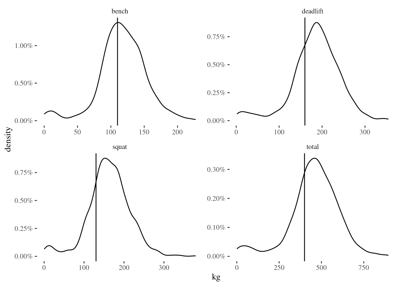
I’ve approximately stayed the same 1, but the field has improved. I see a similar number of entries to last year, so we’re probably looking at an improvement across the field rather than rarer outcomes having a chance to appear.
I’m happy that my numbers stays approximately the same, between the stress of the pandemic, and spending a lot of the last year losing weight.
The (male) graph also appears more bi-modal than last year. This year’s highlight reel isn’t up yet, but during the comp there were plenty of vids of small children lifting impressive loads. I’ll link to the main GGC page in hopes that the highlight reel appears there soon.
Age wasn’t in the public dataset, so I can’t do a kid/adult analysis. :)
What about the female graph?
data %>%
  filter(gender == "Female") %>%
  filter(kg > 0) %>%
  ggplot(aes(x=kg)) +
    facet_wrap("name", scale = "free") +
    geom_density() +
    scale_y_continuous(labels = scales::percent)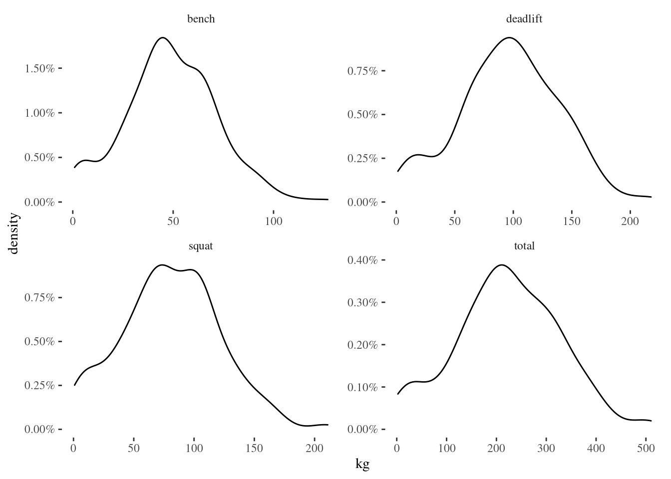
Possibly bimodal, it’s hard to tell.
I don’t want to exclude the 2 “Other”, but 2 points is not stats.
Revisiting “density plot where you can see yourself”
Plotly doesn’t make this easy, and I don’t want to shop for a different Javascript graphing library right now. Especially since I’d probably have do the analysis in JS too, and I don’t wanna.
There’s no native density plot in plotly for R. I can do the graphs above in ggplot and feed them to ggplotly, but those results tend to be good for exploring a dataset rather than publishing.
So I started working on a histogram, and couldn’t get names to appear in the hover. I could get 1 name to appear in the hover, but that’s no good.
Then I remembered that you can do a scattergraph that resembles a histogram. Mouseover for instagram handle | first name.
Male Total
plotly_pipe = function(data){
  data %>%
    filter(kg > 0) %>%
    mutate(id = paste0(instagram_name, "|", first_name)) %>%
    mutate(kg = cut_interval(kg, n= n()/10)) %>% # I learned a new function. Mildly hacky way of dealing with 1/4 as many female entries as male.
    select(id, kg) %>%
    arrange(kg) %>%
    group_by(kg) %>%
    mutate(y = row_number()) %>%
    ungroup() %>%
    plot_ly( x = ~kg, y = ~y, hovertext = ~id  ) %>%
      add_markers()
}

data %>%
  filter(gender == "Male") %>%
  filter(name == "total") %>%
plotly_pipe()Female Total
data %>%
  filter(gender == "Female") %>%
  filter(name == "total") %>%
plotly_pipe()Male Bench
data %>%
  filter(gender == "Male") %>%
  filter(name == "bench") %>%
plotly_pipe()Fenale Bench
data %>%
  filter(gender == "Female") %>%
  filter(name == "bench") %>%
plotly_pipe()Male Squat
data %>%
  filter(gender == "Male") %>%
  filter(name == "squat") %>%
plotly_pipe()Fenale Squat
data %>%
  filter(gender == "Female") %>%
  filter(name == "squat") %>%
plotly_pipe()Male Deadlift
data %>%
  filter(gender == "Male") %>%
  filter(name == "deadlift") %>%
plotly_pipe()Fenale Deadlift
data %>%
  filter(gender == "Female") %>%
  filter(name == "deadlift") %>%
plotly_pipe()I could have done inset graphs, but blogdown would have made them tiny. They’re readable at this scale.
There’s some interesting clustering going on, probably because some folk use kg, some use lbs, and 45lbs doesn’t have an exact analog in kg plates.
Postscript
I was discussing the data with the organiser, and pulled this together that shows New Wilks increasing as training experience increases:
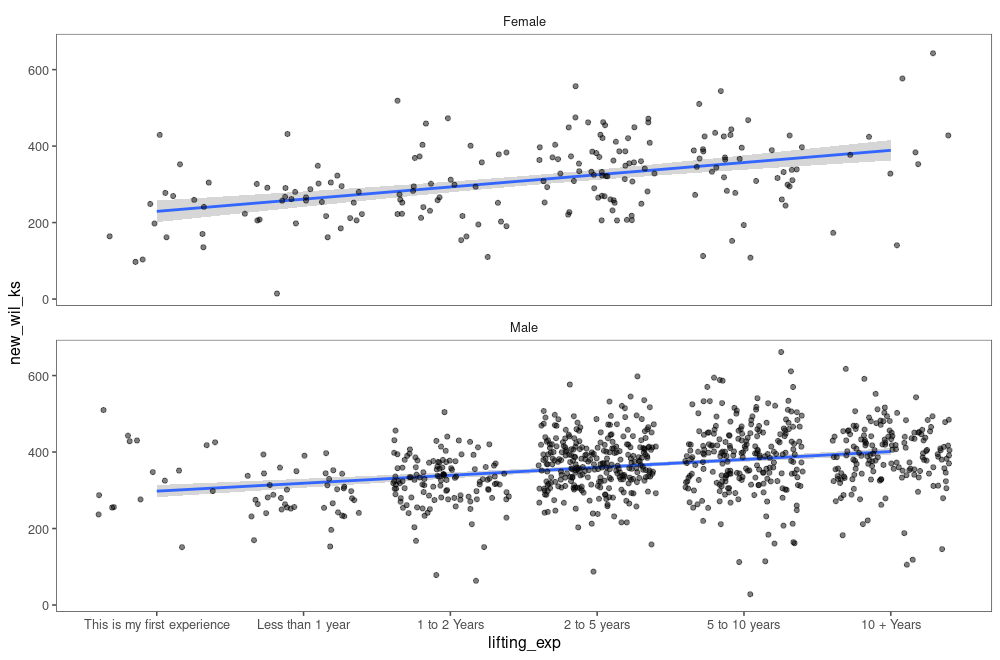
New Wilks tends to increase with training experience, scatterplot of training experience (categorical) against New Wilks score, with a linear regression line for Male and Female small multiples. In both cases the regression line is positive.
I’m not including the code here, since the additional column of “training experience” was privately shared.
Not quite. I’m working with a stricter definition of “full depth” on a squat now and building back up to the old numbers.↩︎