I’ve had a little play with the #GarageGymCompetiton 2020 data
First, a density plot of the Male lifts (rescaled to kg) with myself highlighted:
data <- pin_get("Garagegym-2020")
me <- data %>%
  filter(`IG Handle`=="Jimr1603") %>%
  select(1:5) %>%
  pivot_longer(-1) %>%
  mutate(`Weight (kg)`=value/2.2)

data %>%
  filter(Gender=="Male") %>%
  select(1:5) %>%
  pivot_longer(-1) %>%
  mutate(`Weight (kg)` = value/2.2) %>%
  ggplot(aes(x=`Weight (kg)`)) + geom_density() +
  geom_vline(data=me, mapping=aes(xintercept=`Weight (kg)`))+ facet_wrap(~name) +
scale_y_continuous(labels=scales::percent) + ggthemes::theme_few() 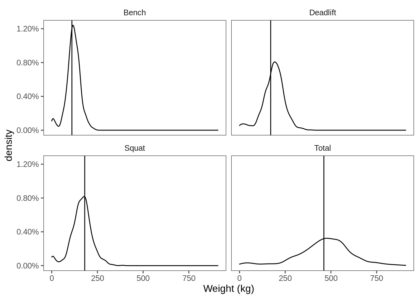
I’m considering seeing if I can throw that sort of thing at Plotly in Javascript and let people see themselves on that plot.
Also, I’ve discovered dumbbell charts in package ggalt so here’s a comparison between people’s totals for this year against last year:
I’m not squishing 80-ish names into the Y-axis there, so I decided to arrange by this year’s total and gave people a number instead of a IG handle.
data %>%
  filter(`Last Year's Total`!=0, Total!=0) %>%
  arrange(Total) %>%
  mutate(`IG Handle`=seq_along(`IG Handle`)) %>%
  ggplot(aes(y=`IG Handle`, x=`Last Year's Total`, xend=Total)) + geom_dumbbell() +
    ggthemes::theme_few() +
scale_colour_viridis_c(labels=scales::percent, option = "C") 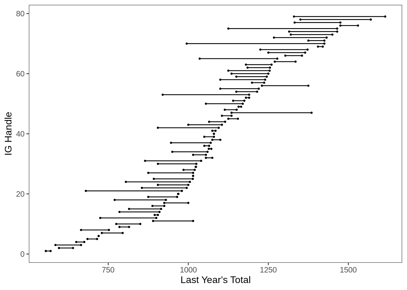
What about last year’s:
data %>%
  filter(`Last Year's Total`!=0, Total!=0) %>%
  arrange(`Last Year's Total`) %>%
  mutate(`IG Handle`=seq_along(`IG Handle`)) %>%
  ggplot(aes(y=`IG Handle`, x=`Last Year's Total`, xend=Total)) + geom_dumbbell() +
    ggthemes::theme_few() +
scale_colour_viridis_c(labels=scales::percent, option = "C") 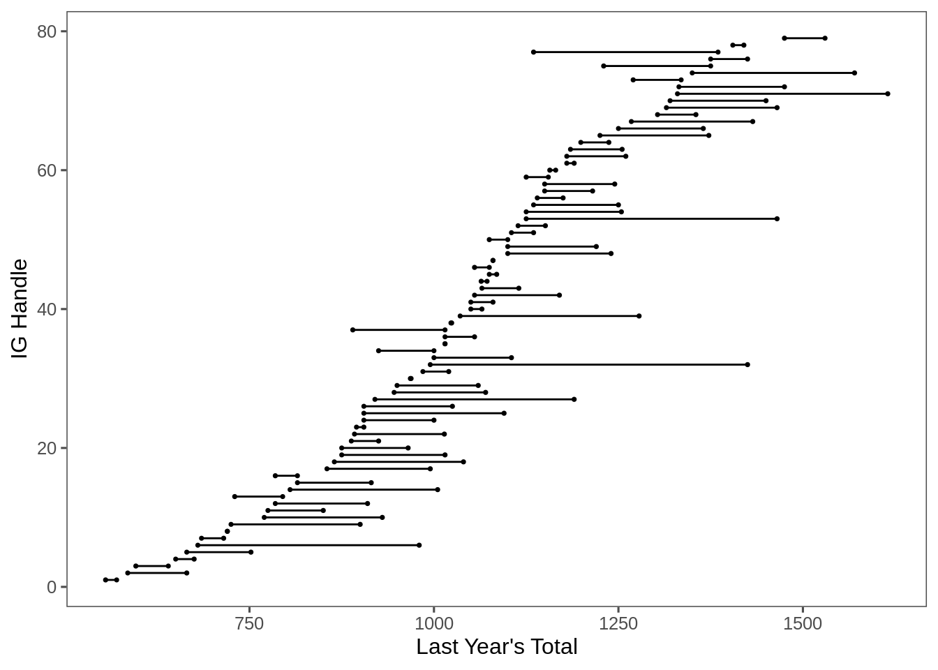
The weirdness is where some people’s totals went down. I’ve not found a nice way to show that on the dumbbell plot.