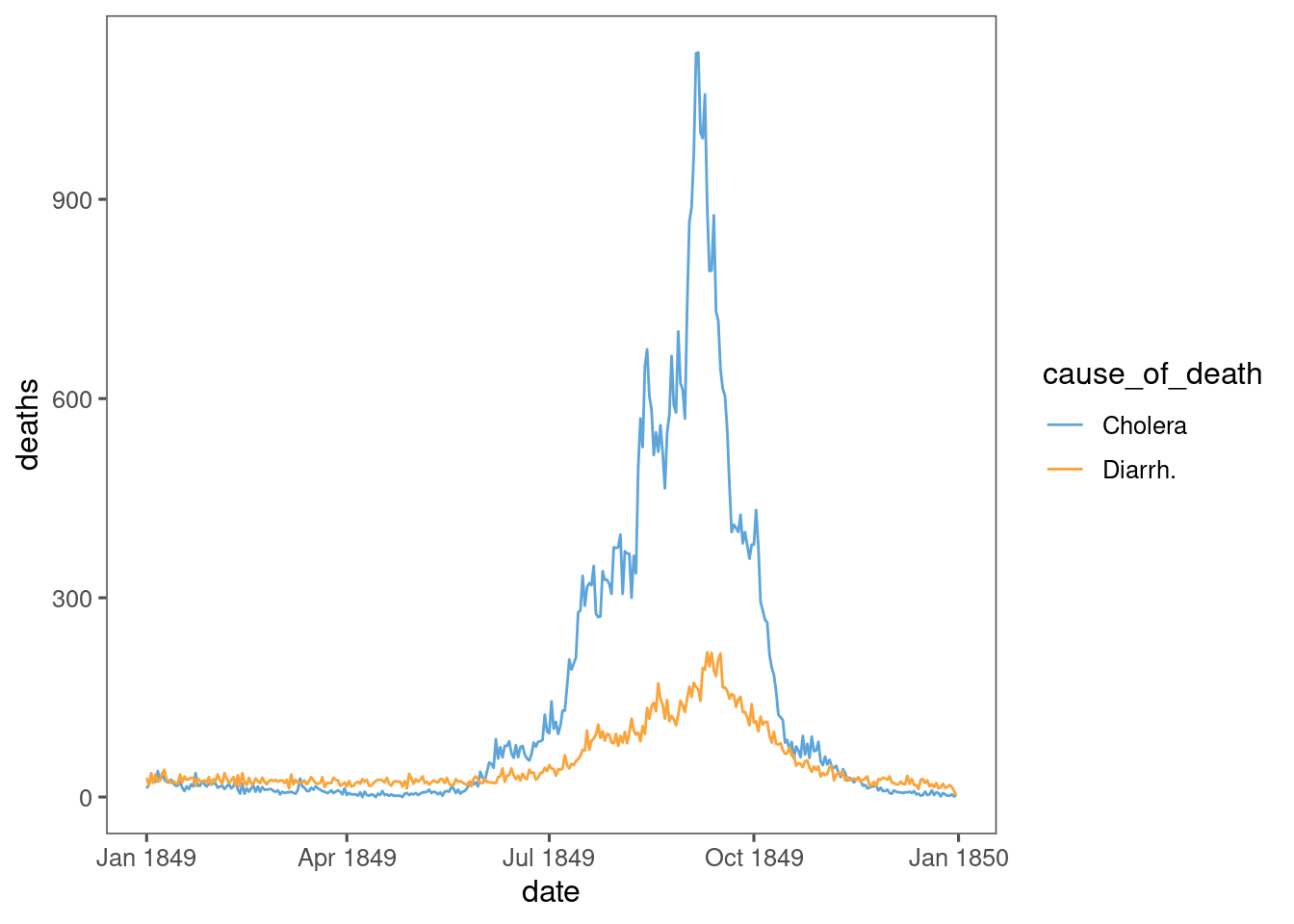
Reading History of Data Visualization following finding some wonderful analysis of Snow’s Cholera map in {Cholera} and {HistData} I saw Farr’s timeseries of Cholera deaths in England, 1849.
The blue and yellow timeseries will be familiar to anyone, anywhere from covid.
Cholera 1849 has special significance - it is likely to be one of few modern pandemics that was completely unmitigated.
data <- read_csv("https://raw.githubusercontent.com/jimr1603/1849-cholera/main/1849%20cholera%20deaths%20England.csv", na = c("-", "")) %>%
  rename("month" = 1) %>%
  rename("cause_of_death" = 3) %>%
  select(month, cause_of_death, `1`:`31`) %>%
  filter(!is.na(cause_of_death)) %>%
  mutate(month = if_else(is.na(month), lag(month), month)) %>%
  pivot_longer(`1`:`31`) %>%
  rename(day_of_month = name) %>%
  mutate(date = str_glue("1849-{month}-{day_of_month}")) %>%
  mutate(date = ymd(date)) %>%
  filter(!is.na(date)) %>%
  rename(deaths = value) %>%
  mutate(day_of_week = wday(date, label = TRUE, week_start = 1))
Straight away, we can replicate the graph:
data %>%
  ggplot(aes(x = date, y = deaths, colour = cause_of_death)) +
  geom_line() +
  ggthemes::scale_colour_few()
Idea: adjust Cholera deaths to account for Diarrh. deaths. Something like Jan-Apr represents a constant number of daily deaths, and daily deaths above that might be mis-labelled Cholera deaths.
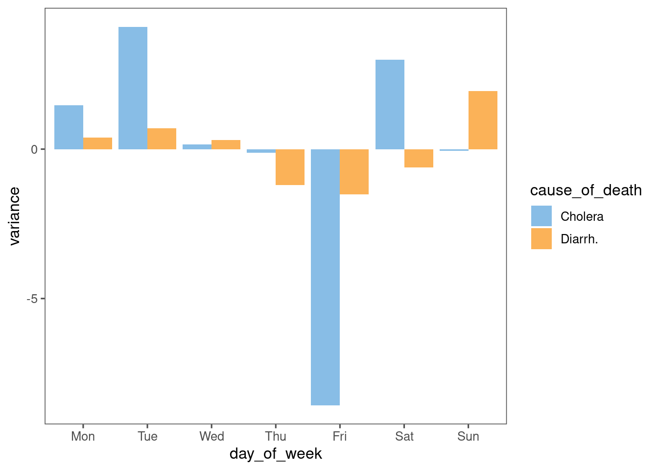
I see the sharp peaks and troughs in the Cholera data, and wonder if there is a day-of-week bias in the data.
data %>%
  mutate(week = week(date)) %>%
  group_by(week, cause_of_death) %>%
  mutate(avg = mean(deaths)) %>%
  ungroup() %>%
  mutate(variance = deaths - avg) %>%
  group_by(day_of_week, cause_of_death) %>%
  summarise(variance = mean(variance)) %>%
  ggplot(aes(x = day_of_week, fill = cause_of_death, y = variance)) +
  geom_col(position = "dodge") +
  ggthemes::scale_fill_few()
There is, but it appears to be anti-Friday. I would have guessed anti-Sunday.
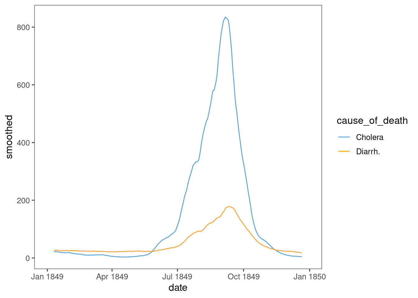
Finally, a rolling average reveals something closer to the differential SIR model:
data %>%
  arrange(date) %>%
  group_by(cause_of_death) %>%
  mutate(smoothed = zoo::rollmean(deaths, k = 20, fill = NA)) %>%
  ungroup() %>%
  ggplot(aes(x = date, y = smoothed, colour = cause_of_death, align = "center")) +
  geom_line() +
  ggthemes::scale_colour_few()
Something like this could be used to fit a SIR model to the data.