Turns out that Sheffield’s method of aggregating LSOA IMD scores is a population-weighted average. This is easy enough, except that it involves JOINing 3 datasets.
LSOA to MSOA took far too long to find here, and a good chunk of my day job is looking up published gov stats.
lsoa_to_msoa = read_csv("data/Output_Area_to_LSOA_to_MSOA_to_Local_Authority_District_(December_2017)_Lookup_with_Area_Classifications_in_Great_Britain.csv") %>%
  janitor::clean_names() %>%
  select(msoa=msoa11cd, lsoa=lsoa11cd)

iod_score = readxl::read_excel("data/File_5_-_IoD2019_Scores.xlsx", sheet=2) %>%
  janitor::clean_names() %>%
  rename(lsoa = lsoa_code_2011)

population_weights = readxl::read_excel("data/File_6_-_IoD2019_Population_Denominators.xlsx", sheet=2) %>%
  janitor::clean_names() %>%
  select(lsoa = lsoa_code_2011, population = total_population_mid_2015_excluding_prisoners)
msoa_imd_scores = left_join(iod_score, population_weights, by="lsoa") %>%
left_join(lsoa_to_msoa, by="lsoa") %>%
group_by(msoa) %>%
summarise(across("income_score_rate":"outdoors_sub_domain_score",
function(x) weighted.mean(x, population))) lgb_plus = readxl::read_excel("data/TS077-2021-1-filtered-2023-01-28T19 48 00Z.xlsx") %>%
janitor::clean_names() %>%
filter(sexual_orientation_6_categories_code > 0) %>% #remove the 0 invalid rows
filter(sexual_orientation_6_categories_code < 5) %>% #remove "not answered" instead of assuming anything
group_by(middle_layer_super_output_areas_code) %>%
mutate(p = observation/sum(observation)) %>%
filter(sexual_orientation_6_categories_code>1) %>%
summarise(lgb_plus = sum(p)) %>%
rename(msoa = middle_layer_super_output_areas_code)trans = read_csv("data/TS078-2021-1-filtered-2023-01-28T21 26 48Z.csv") %>%
janitor::clean_names() %>%
filter(gender_identity_7_categories_code>0) %>%
filter(gender_identity_7_categories_code<6) %>% #remove the not answered awkward cases
group_by(middle_layer_super_output_areas_code) %>%
mutate(p = observation/sum(observation)) %>%
filter(gender_identity_7_categories_code>1) %>% #remove cis
summarise(trans = sum(p)) %>%
rename(msoa = middle_layer_super_output_areas_code)So, turns out that LGB+ folks live in more crime-y areas.
left_join(lgb_plus, msoa_imd_scores, by="msoa") %>%
  ggplot(aes(y=lgb_plus, x=crime_score)) +
    geom_point() +
    geom_smooth(method = "lm") +
    scale_y_continuous(labels = scales::percent)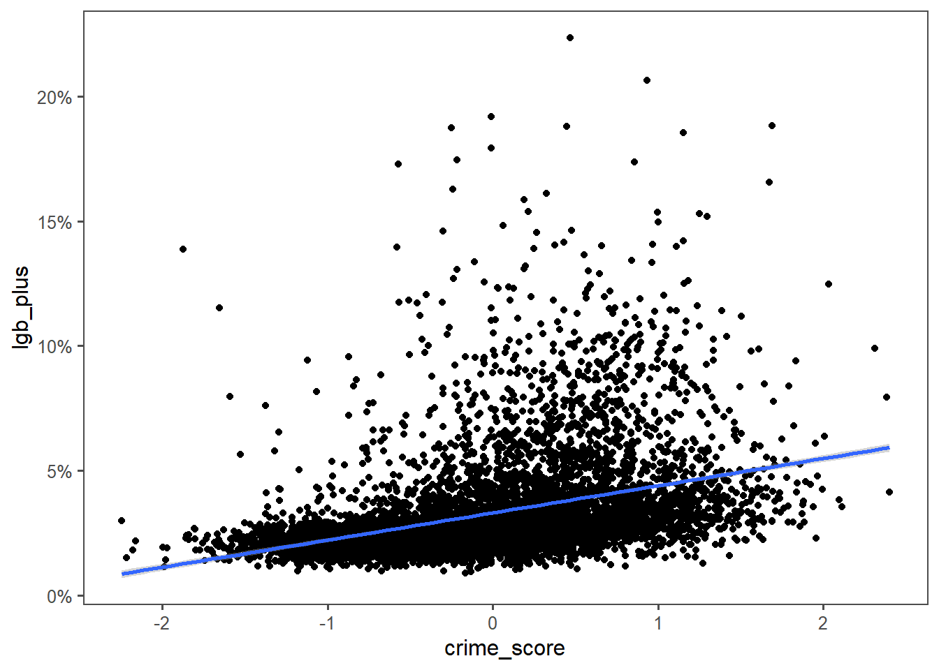
I could make a hypothesis about these folks being more likely to do or be victim of crimes, but the numbers really don’t support that. Look at the Y axis - that line of best fit goes through about 5 percentage points. A difference of 5% of population is likely too small to “explain” the difference between the most crime and lowest crime MSOAs.
Again, likely a rural/urban split. But another example to hold in the bag for spurious correlation.
Another one I was interested in was education level. My social bubble is more queer than average, and more highly educated than average. I mostly wanted to build a post with this title :D
left_join(lgb_plus, msoa_imd_scores, by="msoa") %>%
  ggplot(aes(y=lgb_plus, x=education_skills_and_training_score)) +
    geom_point() +
    geom_smooth(method = "lm") +
    scale_y_continuous(labels = scales::percent)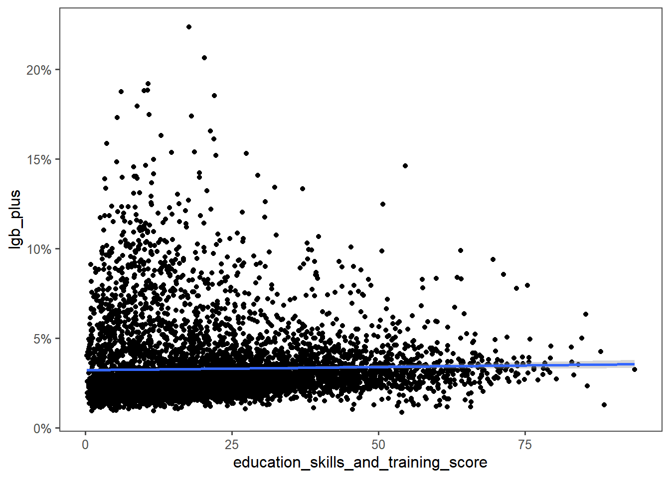
The LGB+ population might be more educated than average, since you could change the education levels of this population without changing this graph significantly. But LGB+ folks don’t concentrate in more highly educated areas.
This surprised me especially as the heatmap graph had LGB+ folks in Leeds concentrated in the university belt.
Similar caveats apply for trans folks. Except moreso because even smaller numbers.
left_join(trans, msoa_imd_scores, by="msoa") %>%
  ggplot(aes(y=trans, x=crime_score)) +
    geom_point() +
    geom_smooth(method = "lm") +
    scale_y_continuous(labels = scales::percent)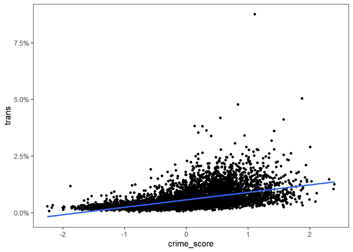
Education wouldn’t be informative at all here, not plotting it.