##Background I learned data.table before tidyverse. It can be hard to read, and I’m always forgetting commas. I’m making an effort to learn the tidyverse, and I am already impressed with dplyr and tibble. (I’ve been impressed with ggplot2 for a while now.)
I’ve seen benchmarks that suggests data.table is about 2ce as fast as tibble. It’s also the case that the code run time is a tiny fraction of my overall project. (Either at home or work.) In either case I make things that run once for an answer, maybe 1ce a year, and we spend way longer QAing the thing than actually running it.
The pipe works really well for anyone who things “I want to do this, then that, and maybe this”. It works a lot like how you’re taught to use Excel, but you get to throw away the intermediate cells.
Personal bugbear is that ggplot doesn’t recognise that my tibble is ordered by Grade, so I had to mutate the
##DWP I wanted a department that I knew had a very different structure to DHSC, so the overall graphs would look different. I also know that they use both an internal and the external grading system, so it would be a good test of what people were actually putting in the “Grade” field. They have a large string that includes way too much info about grade, and I just want the national pay grades. I’ve tidied up the field a bit, but I’ve been overzealous and turned all their Fast Streamers into HEOs or SEOs.
##Other stuff I found the API for data.gov, and have managed to get all the latest Organograms. I’m going to have to do much, much filtering, as I’ve grabbed the last by date, even if it’s a department that no longer exists. I had to grad old ones, because some departments like DHSC haven’t updated in over a year! Script needs tweaking, but when it’s good, it’s going on this blog. In particular, I want to get some of my Python on here.
##Code
juniors <- read_csv(here("static","data","Open Government Licence", "DWP Organogram 31-Sept-2017_2-junior.csv"))

juniors <- juniors %>%
  select(contains("Grade"), contains("FTE"), contains("minimum")) %>%
  mutate(Grade = str_extract(Grade, "FS|AA|AO|EO|HEO|SEO|G7|G6")) %>%
  rename(minimum =  `Payscale Minimum (£)`) %>%
  rename(FTE = `Number of Posts in FTE`)

seniors <-read_csv(here("static","data","Open Government Licence", "DWP Organogram 31-Sept-2017_2-senior.csv"))
## Warning: Missing column names filled in: 'X16' [16]

seniors <- seniors %>%
  filter(Name != "N/A") %>%
  select(contains("Grade"), contains("FTE"), contains("Floor")) %>%
  rename(minimum =  `Actual Pay Floor (£)`) %>%
  filter(minimum > 0) %>%
  rename(Grade = `Grade (or equivalent)`)
For a start, this is many less lines than the equivalent in data.table. read_csv mostly works at pulling a csv into a tibble, and I can start running it through the pipe. To put into plain English, the juniors pipe goes: * take tibble juniors * only keep the columns that have “Grade”, “FTE” or “minimum” in the title * go through the grade column, and extract one of these values in this list * rename the column “payscale minimum (£)” to the more manageable “minimum” * rename another column
Seniors is similar, but filter drops records according to values. Again I have seniors with no pay or no name. Both have slightly different original names that I’m forcing into the new names, so I can’t run them through the same pipe. Maybe in the future when I’m better with this stuff.
I get a warning about what turns out to be a blank column, but I drop it immediately, so I’m not worried.
I’m already ready to merge my tables.
combined <- bind_rows(juniors, seniors) %>%
  arrange(minimum) %>%
  mutate(running_total = cumsum(FTE))
I’ve not yet found a way to tell the median function that I already have a count of population, so I’m working with the cumulative sum again. I can also see in this version that I’ve a lot of people who on paper are the same grade, but at a different payscale min. This will affect the median calculations.
total_staff <- last(combined$running_total)
median_staff <- total_staff/2

median_record <- combined %>%
  filter(running_total > median_staff) %>%
  top_n(-1)
## Selecting by running_total

median_salary <- median_record$minimum
print(median_salary)
## [1] 24476
Relatively straightforward. I create a running total column of all staff, find the halfway point, split the table at that point, and pick the least one (by salary). I’m not altogether happy that top_n(-1) is a thing rather than bottom_n(1), and I might just define the latter in projects.
Turns out the median person in DWP is an EO on 24476. I’m aware that I also should format these as financial numbers for the ease of my reader. There’s probably a good library for this.
combined <- combined %>%
  group_by(Grade) %>%
  summarise(Total_pay = sum(FTE * minimum), FTE=sum(FTE)) %>%
  mutate(avg_minimum = Total_pay / FTE) %>%
  arrange(avg_minimum)

summary_table <- combined %>%
  summarise(sum(Total_pay), sum(FTE))
total_bill_year <- summary_table$`sum(Total_pay)`

kable(combined)| Grade | Total_pay | FTE | avg_minimum |
|---|---|---|---|
| AA | 7112095 | 400.39 | 17762.92 |
| AO | 520271655 | 28184.34 | 18459.60 |
| EO | 830066356 | 33629.10 | 24682.98 |
| HEO | 194052001 | 6706.59 | 28934.53 |
| SEO | 82239251 | 2442.89 | 33664.74 |
| G7 | 76669239 | 1614.16 | 47497.92 |
| G6 | 34441227 | 583.98 | 58976.72 |
| SCS1 | 10920650 | 144.80 | 75418.85 |
| SCS2 | 4215000 | 40.00 | 105375.00 |
| SCS3 | 1010000 | 7.00 | 144285.71 |
| SCS4 | 185000 | 1.00 | 185000.00 |
I now have a nice table for total people at each grade, and the average they are paid at that grade. I might find the median at each grade for comparison, which is doable with group_by. My summary_table makes some of the values I need a bit easier, and I just extract total_pay from it (I already have total FTE).
Grades = combined$Grade
combined <- mutate(combined, Grade = factor(Grade, levels = Grades, ordered=TRUE))
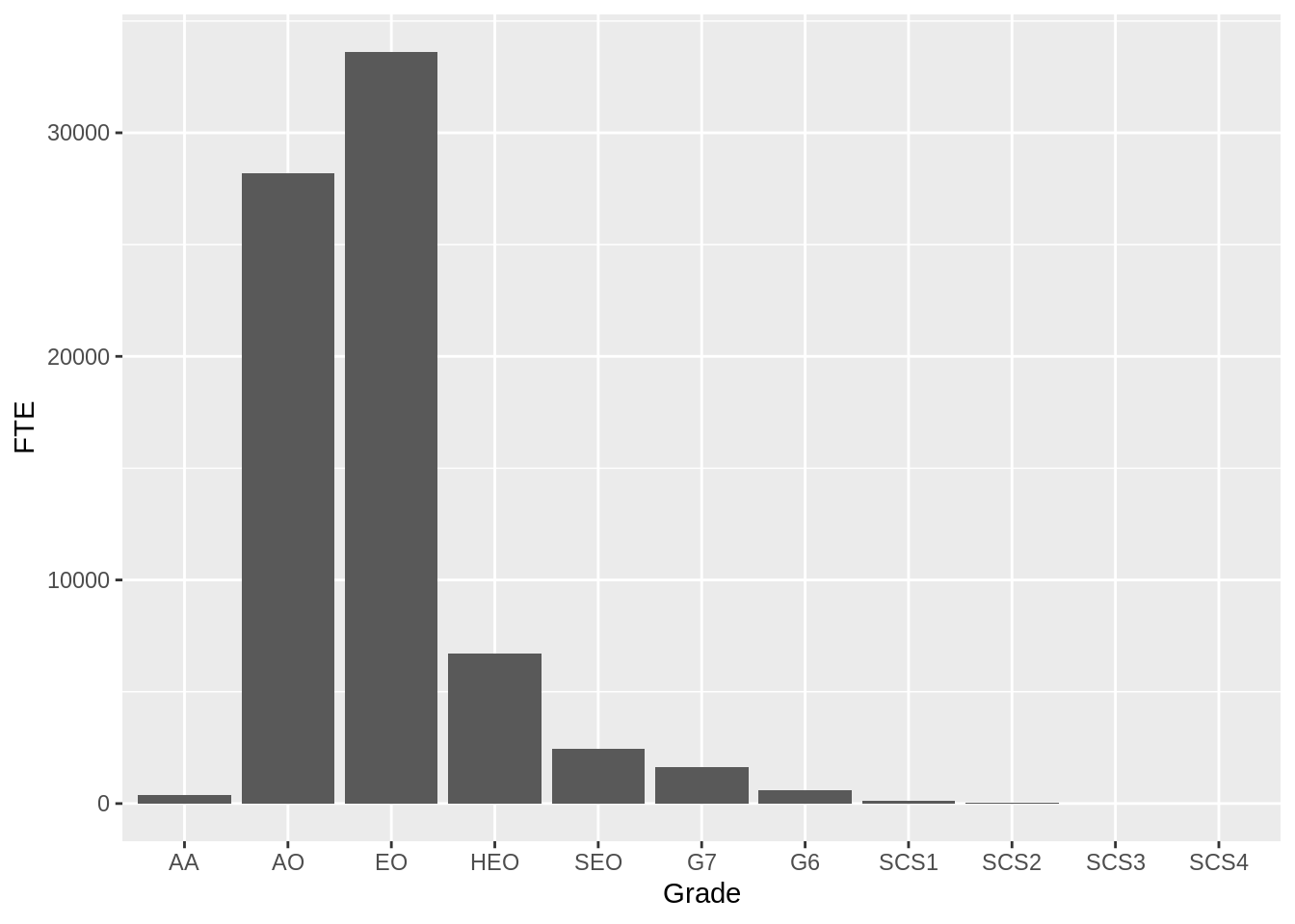
ggplot(combined, aes(y=FTE,x=Grade)) + geom_col()
Three lines that do what I wanted. I extract the values of Grade (remembering that I’ve collapsed every record to their grade, so no repeated values). Also, it’s in order. Then I tell the combined table that it’s not storing Grade as a string, but as a factor, which in this case just tells ggplot that there’s a different order than “alphabetical” to it.
The rest is as before, so outputs are given, but not the code. If you really want, it’s in the GitHub.
## [1] "total staff: 73754.25"
## [1] "median salary: 24476"
## [1] "Cost of salary in DWP per minute: 209788.562355133"
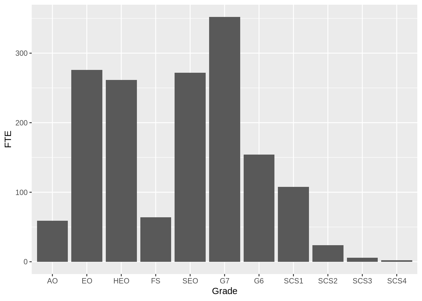
Finally, running the same code with the DHSC data gives the correct graph! (For 2016)
## Warning: Missing column names filled in: 'X16' [16] Always read the Y axis on these things. The peak on the DHSC graph is about 350 FTE. That’s less than almost every bar in DWP. I’m going to think about this sort of thing when I mess with arrays of plots.