##Background
One of the reasons I’ve founded this site is because I’ve discovered https://data.gov.uk/ and I have ideas. In particular, I won’t discuss outside of work anything I only know through work, so it was nice to see pay data in the public sphere.
Full background is at http://guidance.data.gov.uk/organogram-data.html but basically, the Prime Minister decided that the public deserve the structure and hierarchy of the Government Departments, and a few agencies.
All data used in this post was released under the Open Government Licence.
For reference, there’s a good table on Wikipedia explaining what our grading structure is, including some info the MOD have given comparing grades in Civil and Military Service.
##Processing
I have decided that not all of these posts will be final finished polished pieces but will include some work in progress.
Naturally, the first dataset I grabbed was that for the Department of Health and Social Care. Immediately there is a problem - the background above says that the PM wanted everyone to release the data 2ce a year, but our last drop was in 2016. Very often in messing around with data you find that it’s out of date. The other thing you find is that there are data standards which get widely ignored.
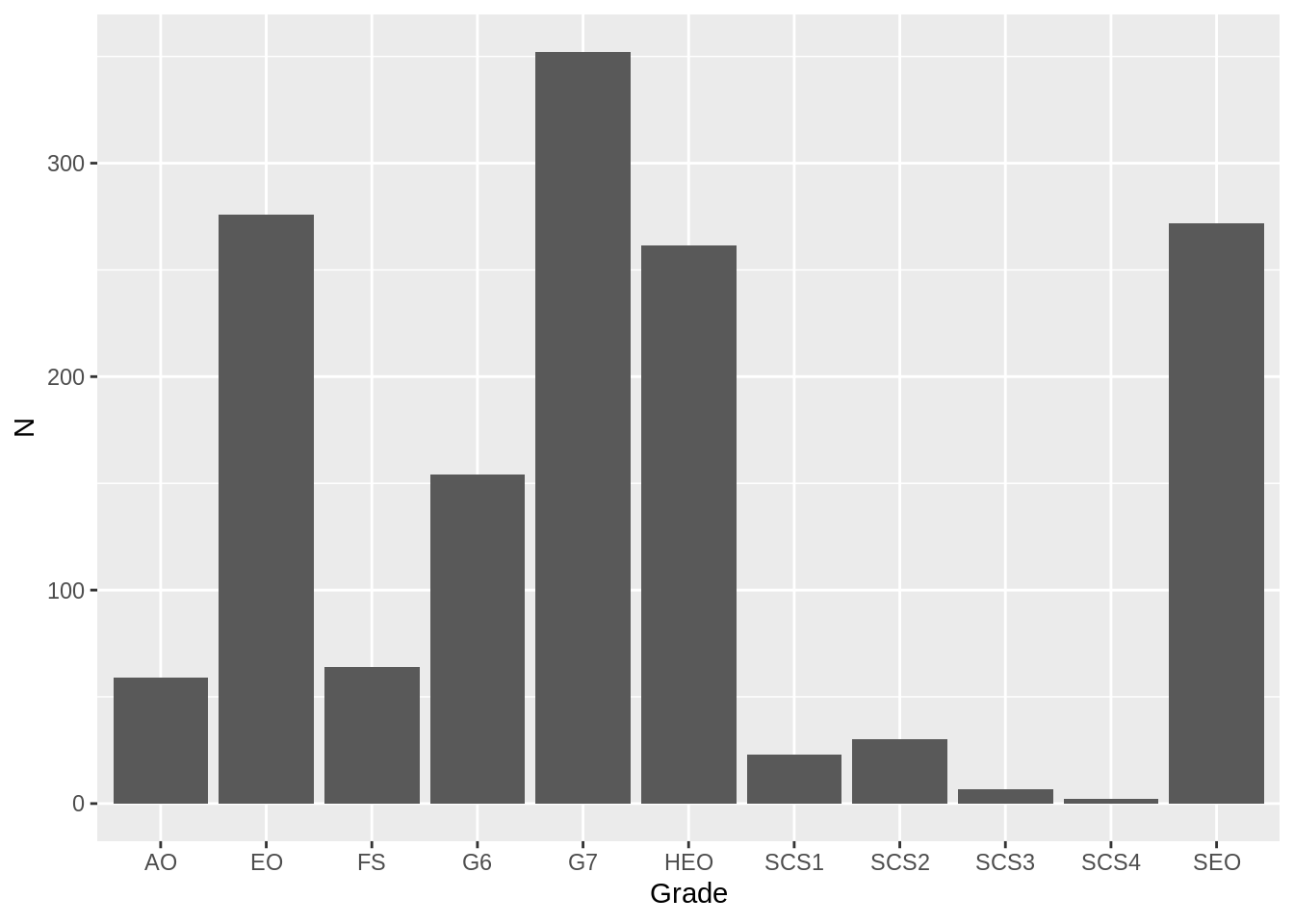
For now I’m interested in finding median salary, and what a department costs per minute/hour. I need the ggplot practice, so I’m doing some column charts of the distributions too.
##Modelling assumptions
Looking at the data, I can see the band for each paygrade, rather than actual pay. So I’m going to guess that everyone is paid at the bottom of their grade. I’m also assuming that everyone has 25 days leave + 9 bank holidays. (9? Yes. Civil servants also get the Queen’s official birthday off.)
I also assume everyone’s on a 37 hour week, because I am.
I am currently modelling just the part of salary that people take home and have not applied any uplifts for employer’s NI or pension contributions. I haven’t looked for pension contributions by department yet, and I’ve not yet looked up and coded the NI contributions.
Together, these should mean there is something of an underestimate in the actual cost of staffing, but should be reasonable for looking at average gross salary.
##DHSC
This went reasonably smoothly, possibly given that I know the grading scheme. Someone along the line had decided that we wanted info on removed Senior Civil Servants, so I had to filter them out. This processing was done on a data.table framework.
c <- read.csv(here("static", "data", "Open Government Licence","department-of-health__31-03-2016__dh_010416-DH-Organogram-junior.csv"), stringsAsFactors = FALSE)
d <-read.csv(here("static", "data","Open Government Licence", "department-of-health__31-03-2016__dh_010416-DH-Organogram-senior.csv"), stringsAsFactors = FALSE)

c <- as.data.table(c)
d<- as.data.table(d)
juniors = c[,.(N=sum(Number.of.Posts.in.FTE),min=min(Payscale.Minimum....),max=max(Payscale.Maximum....)),by=Grade]
seniors = d[!(Name %in% c("N/D","ELIMINIATED", "VACANT")),.(N=sum(FTE),min=max(Actual.Pay.Floor....),max=max(Actual.Pay.Ceiling....)),by=Grade..or.equivalent.]Then I wanted to append one table to the other. For that they need column names that match. Since I want to find a median I need a cumulative sum, and to find the middle person.
combined <- rbindlist(list(juniors,seniors))

combined <- combined[order(min)]

combined[,cumulative:=cumsum(N)]

total_staff <- combined[,sum(N)]
median_record <- combined[cumulative>total_staff/2][1]
median_salary = median_record[,min]
Then total bill over an estimate at total hours worked in a year gives me the total bill for the department per hour and per minute.
total_bill_min <- combined[,sum(N*min)]
total_hours <- (365.25 / 7 * 5 - 25 -9) * (37/5)

avg_hourly <- median_salary/total_hours
avg_minutely <- avg_hourly/60
And so I get my outputs, which I’ve not nicely formatted yet.
total_staff
## [1] 1500.51

median_salary
## [1] 33675

total_bill_min
## [1] 57656342

avg_hourly
## [1] 20.0565

ggplot(data=combined, aes(Grade, N)) + geom_col()
In fact, that’s a totally wrong plot! ggplot has decided it knows my labels better than me and thinks it can do better. I could manually set it, but I’m already past bed time on a work night.