The Census 2021 is beginning to release data, and my corners of society have been excited at the maps showing where people identifying as Lesbian, Gay or Bisexual+ and gender identity not the same as assigned at birth.
I tip my hat to the ONS. The census isn’t the most exciting thing, but they are such expert data communicators that my mates were talking about map plots without me bringing it up.
Of course, data is downloadable: Census 2021 sexuality
This is collected to “medium super output area” (MSOA), which makes sense given how many lower SOAs would return 1 or 0 not-heterosexual people.
The obvious trend is that LGBT+ folks tend to be concentrated in the cities. Possibly in university cities. This is especially clear in Wales. So some things that share the urban/rural split will follow a LGBT+ gradient, and one can draw spurious correlations.
The indexes of multiple deprivation are normally reported at the LSOA level, but University of Sheffield/MySociety collated the stats to MSOA level. Good for me - I’d probably have done something not as good without a citation!
More deprived areas are more likely to be more LGB+
(Left is more deprived, right is less deprived.)
census = readxl::read_excel("data/TS077-2021-1-filtered-2023-01-28T19 48 00Z.xlsx") %>%
  janitor::clean_names() %>%
  filter(sexual_orientation_6_categories_code > 0) %>% #remove the 0 invalid rows
  filter(sexual_orientation_6_categories_code < 5) %>% #remove "not answered" instead of assuming anything
  group_by(middle_layer_super_output_areas_code) %>%
  mutate(p = observation/sum(observation)) %>%
  filter(sexual_orientation_6_categories_code>1) %>%
  summarise(lgb_plus = sum(p))

imd = read_csv("data/imd2019_msoa_level_data.csv") %>%
  janitor::clean_names(  )


left_join(imd, census,
          by = c( "msoac" = "middle_layer_super_output_areas_code")) %>%
  ggplot(aes(msoarank, lgb_plus)) + geom_point(alpha = 0.1) +
  geom_smooth(method = "lm") +
  ggthemes::theme_few() +
scale_y_continuous(labels = scales::percent) 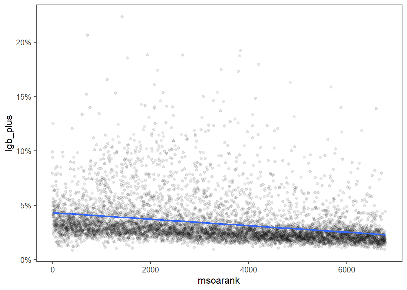
Eyeballing the most LGB+ areas, I wonder if Brighton and Hove is skewing the results - it is both very LGB+ and coastal, and coastal tends to mean more deprived.
Maybe if I facet by region:
left_join(imd, census,
          by = c( "msoac" = "middle_layer_super_output_areas_code")) %>%
  ggplot(aes(msoarank, lgb_plus)) + geom_point(alpha = 0.1) +
  geom_smooth(method = "lm") +
  ggthemes::theme_few() +
  scale_y_continuous(labels = scales::percent)  +
  facet_wrap("reg")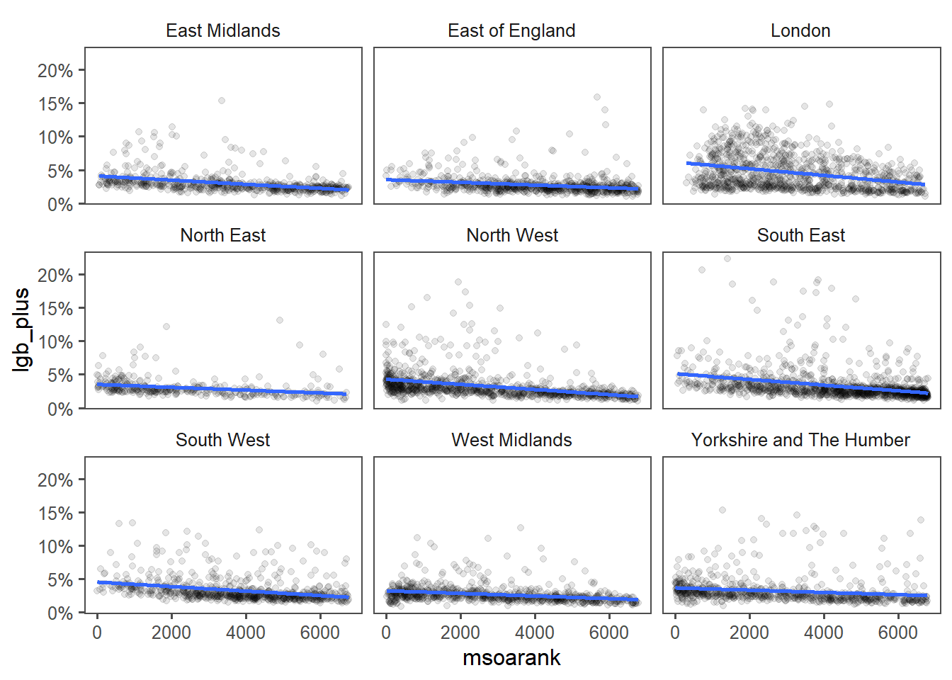
Practically no correlation in Yorkshire and the Humber, which somewhat matches what I see in the map - there are better and worse areas that are more and less LGB+. Often along urban/rural lines, but with significant suburban outclaves.
Trans*
For keeping definining terms below a whole sentence, I’ll use:
- cisgender (cis): answered on the census that their gender identity is the same as the sex registered at birth.
- transgender (trans): answered on the census that their gender identity is not the same as the sex registered at birth.
This is overbroad for some folks. This includes folks who entirely identify as male or female, and this identity is stable, as well as folks who sometimes identify as one, sometimes the other, sometimes neither, folks who identify as neither all the time… it’s a broad camp.
However, it matches a 2-category split the ONS used, and while the data has more categories, I’m going to follow their lead.
trans = read_csv("data/TS078-2021-1-filtered-2023-01-28T21 26 48Z.csv") %>%
  janitor::clean_names() %>%
  filter(gender_identity_7_categories_code>0) %>%
  filter(gender_identity_7_categories_code<6) %>% #remove the not answered awkward cases
  group_by(middle_layer_super_output_areas_code) %>%
  mutate(p = observation/sum(observation)) %>%
  filter(gender_identity_7_categories_code>1) %>% #remove cis
  summarise(trans = sum(p))
First graph looks vaguely similar.
left_join(imd, trans,
          by = c( "msoac" = "middle_layer_super_output_areas_code")) %>%
  ggplot(aes(msoarank, trans)) + geom_point(alpha = 0.1) +
  geom_smooth(method = "lm") +
  ggthemes::theme_few() +
scale_y_continuous(labels = scales::percent) 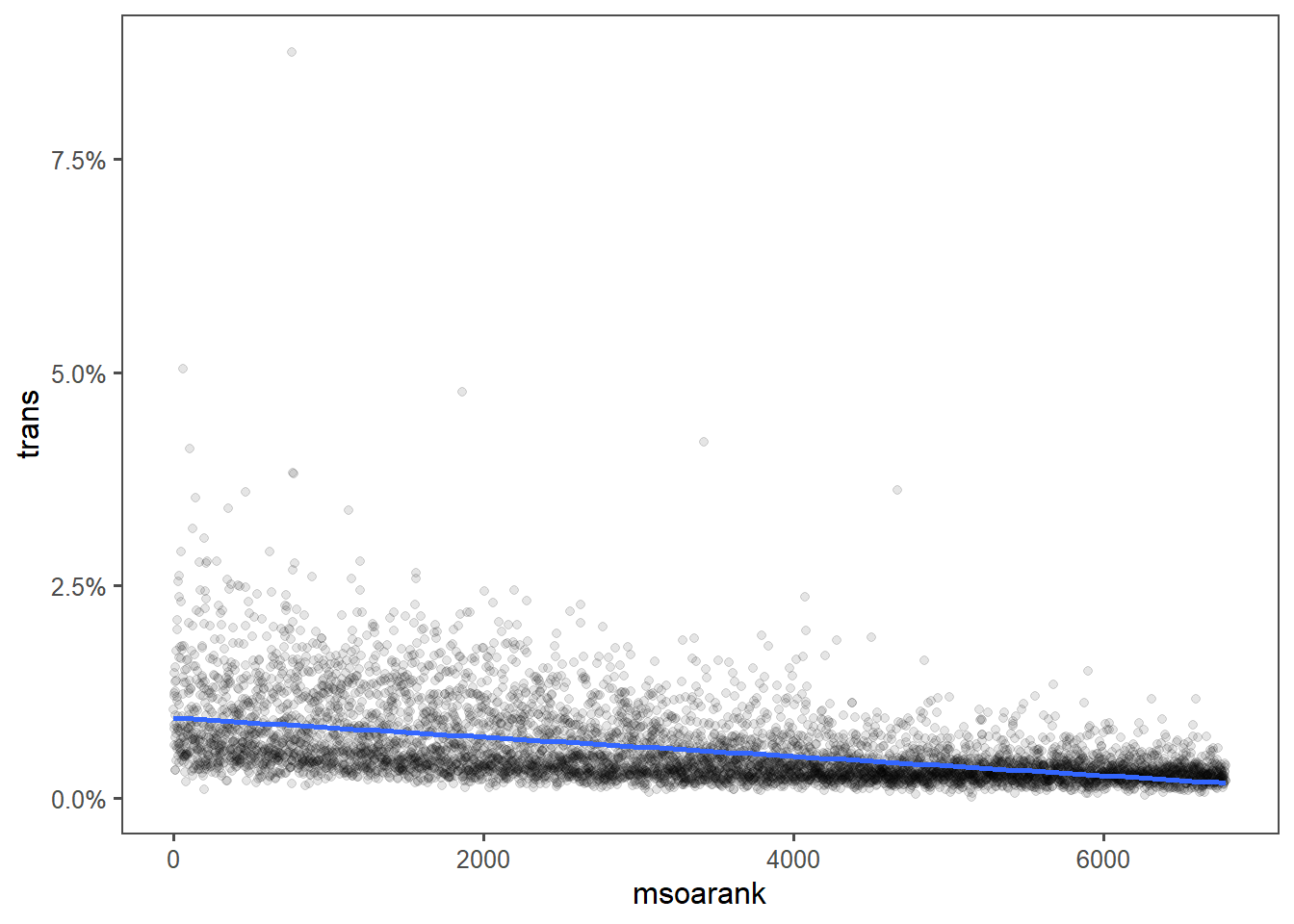
As does the 2nd:
left_join(imd, trans,
          by = c( "msoac" = "middle_layer_super_output_areas_code")) %>%
  ggplot(aes(msoarank, trans)) + geom_point(alpha = 0.1) +
  geom_smooth(method = "lm") +
  ggthemes::theme_few() +
  scale_y_continuous(labels = scales::percent) +
  facet_wrap("reg")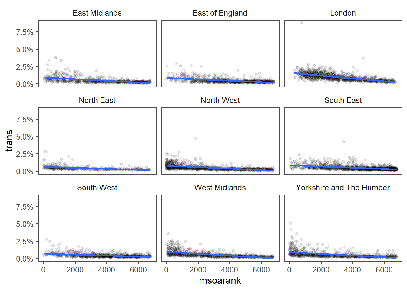
Likely because both are more correlated with each other:
left_join(census, trans) %>%
  ggplot(aes(x=lgb_plus, y=trans)) + geom_point(alpha = 0.1) +
  geom_smooth(method = "lm") +
  scale_x_continuous(labels = scales::percent) +
  scale_y_continuous(labels = scales::percent)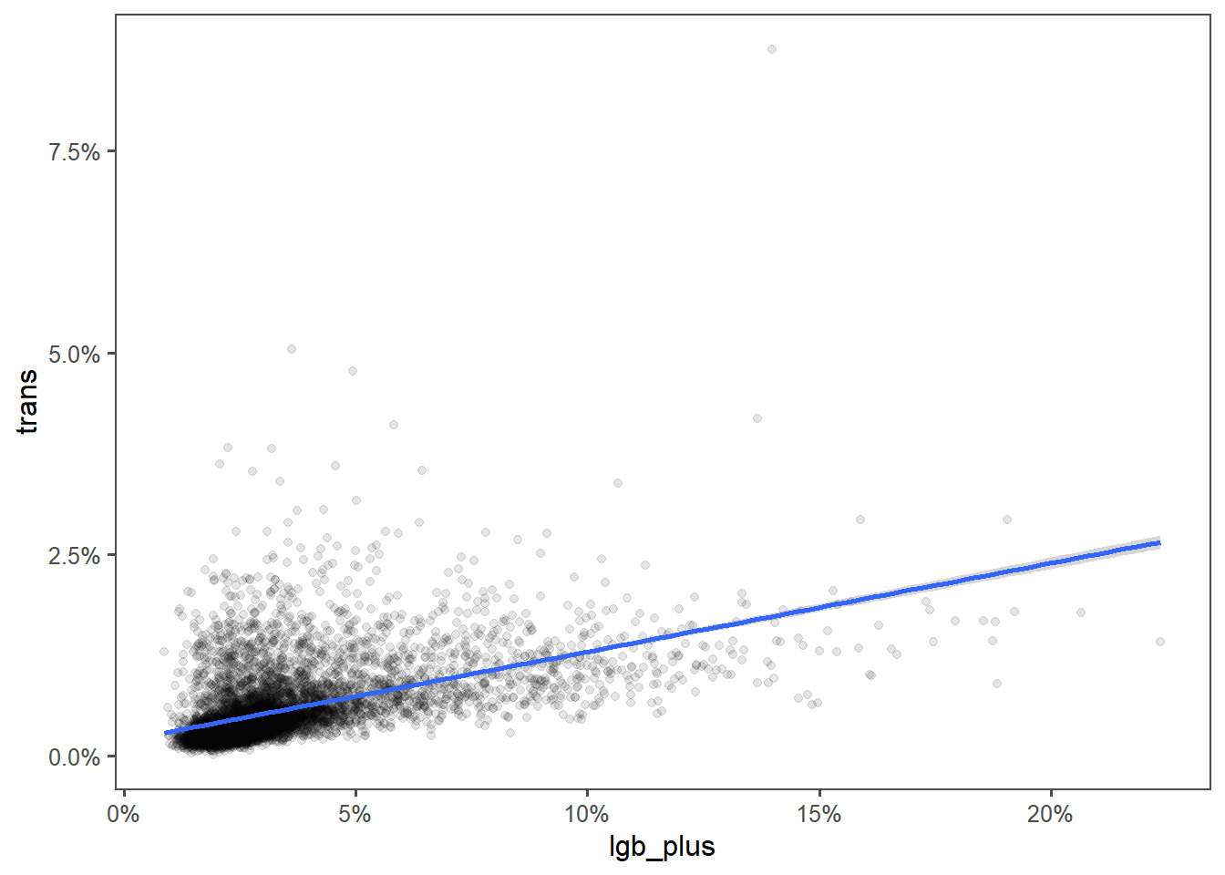
Some days you do statistical tests, some days you slam down a overplotted scatter graph with a line of best fit.
Caveats
This is based on self-deceleration on the census, and not everyone has ideal privacy when filling in the census. There could easily be closeted folks that my stats show as heterosexual.
The cleanest solution I had for “did not answer” was to exclude them from the analysis. Cleaner, more robust, and more appropriate for a formal setting would be to include these, mapped to some 3rd category. Or to verify that they are genuinely small numbers.
This is a single snapshot on a single day, performed once a decade. I am certain that some people would answer differently today.
Throwing away the -8 coding for “not applicable” removed 0 people. Thanks ONS for including it for completeness.
The stats don’t allow analysis of LGB+ & Trans. Disambiguating sexuality and sexual identity is useful from ONS’s point of view, clearly, but the unity of the LGBT+ community is being a bit of a wedge issue these days. Ok, like any Union there’s been subdivisions, but come on folks, some of the first bricks at the Stonewall riots were thrown by trans pioneers.
On the other hand, separating sexuality and gender identity helps break down the myth that a transwoman must be attracted to men, or vice versa. In fact the language ONS uses especially in the publication is very inclusive of nonbinary identities.
Bloopers
A typo in an earlier iteration resulted in 100% of every MSOA coming back as LGB+. Temporarily making 100% of the Eng & Wales population LGB+ might be my new favourite error. I am told I need to cite K Curbain for this one.
Clickbait?
IMD is an aggregate of multiple factors, one of which is crime. I’m going to extend this to look at some of the interesting factors of IMD against LGBT+ concentration, but that’ll involve studying the method U Sheffield did to scale LSOA to MSOA, and that’s a decent spot to break for a part 2.